Overview
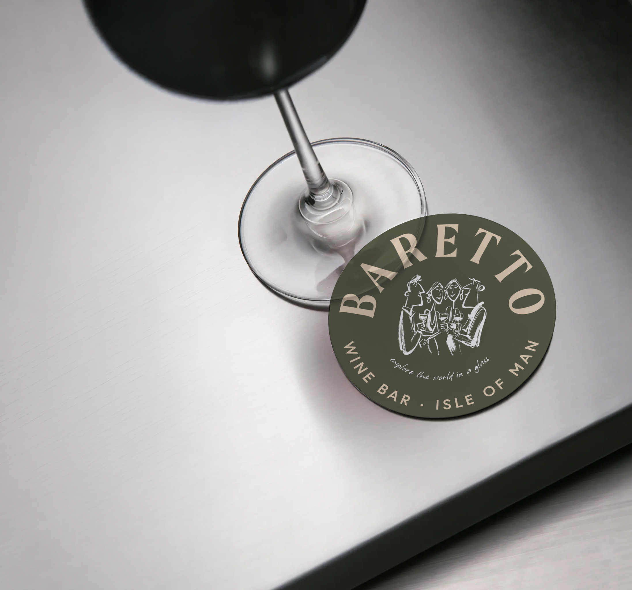
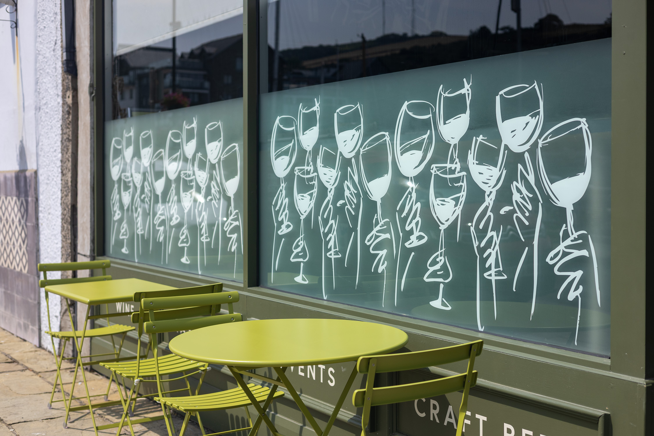
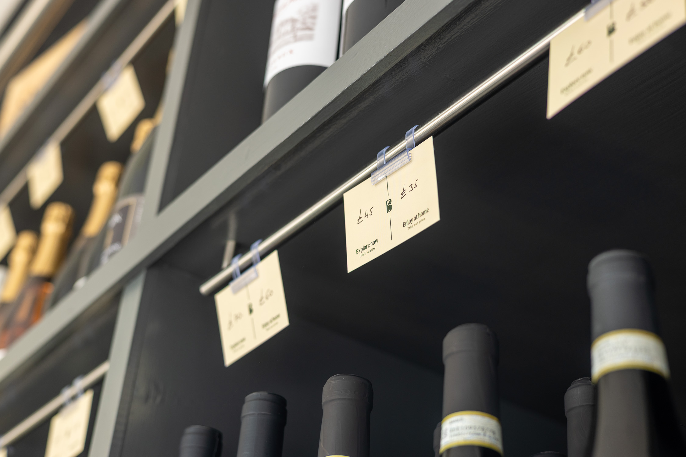
Inspired by the warmth of Italian hospitality, the visual identity pairs relaxed sophistication with a welcoming, timeless aesthetic. A bespoke ‘B’ brandmark subtly incorporates a wine glass, creating a distinctive symbol that feels both refined and effortlessly memorable. The Olive Green and Ivory colour palette balances warmth, authenticity and understated elegance. It feels timeless rather than trendy. Hand-drawn illustrations make the brand feel approachable, breaking away from the exclusivity often associated with wine. Free from polished photography and generic icons, they add warmth, personality and a distinctly human quality to the visual identity.
Brand Identity






No items found.
Testimonial
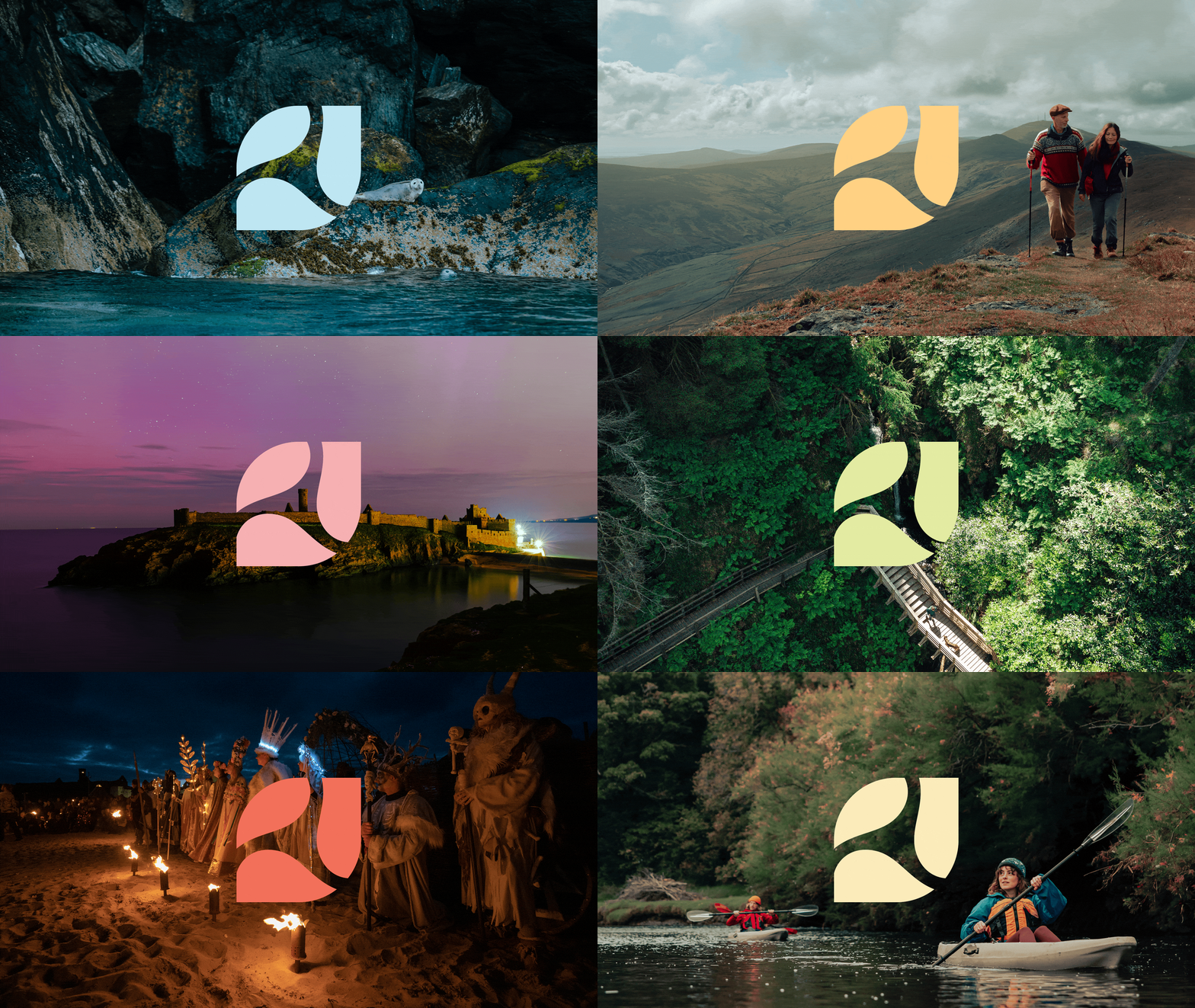
We had the immense pleasure of working with Studio Cooper on our ‘Extraordinary Isle’ campaign, and we could not be more thrilled with the results. Every detail of the brand design was crafted with care, precision, and an extraordinary sense of place that truly brought the spirit of the Isle of Man to life. What set Jon apart was not just his creativity, but his unwavering commitment to collaboration, responsiveness to feedback, and above-and-beyond attitude throughout the entire process.
Natasha Johnson
Visit Isle of Man